
Which Graphic Tee Colors Layer Best?

Last Updated: November 1, 2026
Quick Summary
The best graphic tee colors for layering are neutrals like white, off-white, black, and charcoal, because they support the print instead of competing with it. Choose the tee's color first, then match the outer layer by contrast and undertone.
- Neutral tees like white, off-white, black and charcoal keep the focus on the print and outer layer.
- High contrast, such as a black tee under a cream jacket, makes each layer read as its own piece.
- Warm-with-warm or cool-with-cool pairings almost always look intentional.
- Match the quietest color in a multi-colored graphic when choosing the outer layer.
- Use a light tee under a dark layer, or a dark tee under a light layer, in dark seasons.
Table of Contents
- Neutral Graphic Tee Colors That Layer Without Competing
- Graphic Tee Color Combinations Built on Contrast and Undertone
- What to Wear Over a Graphic Tee for Each Season
- Graphic Tee With Hoodie and Graphic Tee With Flannel Outfits
- How to Layer Without Hiding the Print and Care for Your Colors
- Choosing Your Next Graphic Tee to Build Your Layering Wardrobe
- Frequently Asked Questions
You're Boring builds its premium streetwear around bold designs, so we know how much a graphic can be lost under the wrong layer. This guide walks through which tee colors layer well, which combinations clash, and how to keep the print visible.
The core idea is simple: neutral tees support the graphic, while bright tees compete with it. Once you see that, most decisions about graphic tee colors get easier.
Neutral Graphic Tee Colors That Layer Without Competing
Neutral tees are the safest base for layering. They keep the focus on the print and the outer layer, and they pair with almost any color you already own.
White and off-white graphic tees
A white or off-white tee is the most flexible option you can own. It brightens darker layers, and it keeps a print crisp under an open jacket. Cream and ivory versions work especially well under earth-toned overshirts.
Our Essential Cotton T-Shirt is a practical starting point. It is made from 100% cotton with a loose fit. You can shop the Essential Cotton T-Shirt in neutral colors.
Black and charcoal graphic tees
Black and charcoal tees create a strong, minimal base. They work best under lighter outer layers, such as a light denim jacket or a cream cardigan, where the contrast keeps the outfit from looking flat.
Our Do Less Tee is an oversized, heavyweight option in Jet Black.
Graphic Tee Color Combinations Built on Contrast and Undertone
Most layering guides stop at "wear neutrals." That advice is safe but incomplete. The more useful skill is matching a specific tee color and graphic color to a specific layer color, using two variables: contrast level and undertone. Get those right and almost any combination works; get them wrong and even two nice pieces look accidental.
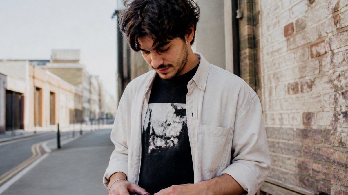
The two variables that decide every pairing
Contrast is the lightness difference between your tee and your outer layer. High contrast (black tee, cream jacket) makes each layer read as a separate piece and draws the eye to the boundary, which is usually where your graphic sits.
Undertone is whether a color leans warm (yellow, red, orange base) or cool (blue, green, violet base). Warm-with-warm and cool-with-cool almost always look intentional.
A practical color-pairing matrix
Use this as a starting point, then adjust for the graphic's own colors.
- White or off-white tee: pairs cleanly with black, navy, charcoal, olive, rust, and camel layers. Under a cream layer it goes low-contrast and tonal; under black it goes high-contrast and graphic-forward. Avoid pairing with a pure-white outer layer unless you want a uniform, almost monochrome look.
- Black tee: strongest under cream, camel, light denim, and heather grey. Under navy or charcoal it becomes a low-contrast, moody look, good for evening, weaker for daytime visibility of the print.
- Charcoal or heather grey tee: pairs with black, navy, olive, burgundy, and denim. This is the most forgiving mid-tone base because it sits between light and dark layers without fighting either.
Matching the graphic's colors, not just the tee's
The tee color is only half the equation. Look at the dominant color inside the print and use it to choose the layer:
- If the graphic is monochrome or black-and-white, almost any solid layer works, this is the easiest category to layer.
- If the graphic has one accent color, echo that accent in the outer layer or in a secondary piece (beanie, sneakers) to tie the outfit together.
- If the graphic is multi-colored, pick the quietest color in the print and match the layer to it. Matching the loudest color usually overwhelms the outfit.
When a warm tee meets a cool layer
A warm-cream tee under a cool-grey jacket often looks accidental because neither piece references the other. The fix is a bridge: a graphic that contains both warm and cool tones, or a third piece (a scarf, a cap, a bag) that repeats one of the temperatures. Without a bridge, swap one piece so both sit on the same side of the warm-cool divide.
Undertone quick reference
- Warm palettes: cream, ivory, camel, tan, rust, olive, warm grey, chocolate brown.
- Cool palettes: pure white, black, navy, charcoal, cool grey, burgundy, forest green.
- Neutral bridge colors: denim blue, heather grey, and true black sit comfortably with both warm and cool layers, which is why they show up in almost every layering wardrobe.
Once you know your tee's undertone and the contrast level you want, the layer color becomes a short, deliberate choice instead of a guess.
Here is a quick reference for how common tee colors pair with outer layers, based on the contrast and undertone guidance above.
| Tee color | Pairs well with | Avoid or note |
|---|---|---|
| White or off-white | Black, navy, charcoal, olive, rust, camel | Pure-white outer layer goes near monochrome |
| Black | Cream, camel, light denim, heather grey | Navy or charcoal goes low-contrast and moody |
| Charcoal or heather grey | Black, navy, olive, burgundy, denim | Most forgiving mid-tone base |
| Navy | Grey, cream, tan, olive | Avoid black unless the graphic contains both |
| Olive or khaki | Cream, rust, black, denim | Warm olive with warm tones; cool olive with grey and navy |
| Burgundy or rust | Cream, camel, charcoal, denim | Keep outer layer neutral; tee carries the color |
What to Wear Over a Graphic Tee for Each Season
Season changes the outer layer, not the tee, but it should also change the color logic. The same white graphic tee that looks crisp under a black denim jacket in spring can look flat under a heavy winter coat if the color contrast is wrong. Use the season to decide both the layer type and the layer color.
Spring: light layers, higher contrast
Spring layering is about one light outer piece over a tee, with enough contrast that the graphic stays visible.
- Best layers: an unstructured overshirt, a light denim jacket, a thin cotton chore coat, or an open flannel.
- Best tee colors: white, off-white, heather grey, and light-wash-friendly blues.
- Best layer colors: light denim, olive, sand, and pale grey. These keep the outfit bright without competing with the print.
Summer: the layer becomes optional
In heat, the "layer" is often an open shirt or a thin cardigan worn more for style than warmth. The goal is to add depth without hiding the graphic.
- Best layers: an open short-sleeve button-up, a lightweight linen overshirt, or a thin knit cardigan worn open.
- Best tee colors: white, off-white, and pale grey, light tees reflect heat and keep the print readable in bright light.
- Best layer colors: white, sand, pale blue, and washed olive. Avoid heavy black layers in direct sun; they absorb heat and flatten the contrast of the outfit.
Autumn: texture and mid-tone contrast
Autumn is where layering gets interesting, because you can add texture, leather, suede, corduroy, heavy cotton, without adding bulk.
- Best layers: a leather or suede jacket, a corduroy overshirt, a heavy flannel, or a denim jacket.
- Best tee colors: black, charcoal, navy, and burgundy, darker tees hold their own against textured layers.
- Best layer colors: tan, rust, olive, chocolate brown, and black. Warm earth tones pair naturally with the season and with warm-leaning graphics.
Winter: heavy layers, deliberate contrast
Winter layering adds weight, so contrast becomes more important, a dark tee under a dark coat can disappear entirely.
- Best layers: a wool overcoat, a heavy parka, a shearling jacket, or a thick knit cardigan.
- Best tee colors: white, off-white, and heather grey under dark coats; black and charcoal under cream or camel coats.
- Best layer colors: black, navy, charcoal, cream, and camel. Cream and camel coats are the easiest way to keep a dark tee visible in winter.
Adapting the same tee across seasons
A single white graphic tee can carry you through all four seasons if you change the layer color around it: light denim in spring, an open linen shirt in summer, a tan leather jacket in autumn, and a black overcoat in winter. The tee stays the same; the contrast and undertone of the layer do the seasonal work.
Graphic Tee With Hoodie and Graphic Tee With Flannel Outfits
Layering a graphic tee under a hoodie or flannel is a common way to wear one. For ideas on making an oversized hoodie look intentional, see oversized hoodie outfit ideas.
Our Oversized Unisex Long Sleeve T-Shirt has a drop shoulder and a loose fit.
For a flannel, leave the top buttons open so the print shows. Choose a neutral tee in a color that matches one of the flannel's main tones.
How to Layer Without Hiding the Print and Care for Your Colors
Color care matters just as much. Wash darker tees inside out in cold water to slow fading. Our Essential Cotton T-Shirt is machine washable at 30°C on a gentle cycle, and it should be tumble dried on low. Avoid ironing directly on the print, and iron at a low temperature when needed.
Care keeps colors looking sharp over time, which is what keeps a layered outfit looking intentional.
Choosing Your Next Graphic Tee to Build Your Layering Wardrobe
Start with two or three neutral tees, then add one or two bolder graphics. A solid base lets your statement prints do the talking without fighting every jacket you own. Before you buy, read our guide to picking funny graphic tees that look premium, covering fabric, print quality and fit. To find a dark-series graphic tee that fits this neutral palette, browse the Men's Power Tee Dark Series Two.
If you are building from scratch, our Men's You're Boring Tee Series Two is a solid pick for everyday layering. For a slimmer silhouette under a jacket, the Unisex Heavyweight Slim Fit T-Shirt keeps the outline clean.
Pick your base colors first, then choose the graphic. That order keeps every layer working together.
Frequently Asked Questions
What color graphic tee is easiest to layer?
White and black are the easiest to layer because they work under almost any outer piece without competing. A white graphic tee keeps a denim jacket or hoodie looking bright and clean, while a black tee gives a darker, more streetwear look and hides wear better. If you are starting a layering wardrobe, buy one of each before trying brighter colors. Once you know how your outer layers sit over a neutral base, you can add a bolder tee with more confidence.
What colors go well with a black graphic tee?
Black graphic tees pair well with earth tones like olive, camel and brown, as well as with grey, cream and denim. Cream and white outer layers create strong contrast that makes the print stand out. For a tonal look, layer charcoal or dark grey over the black tee so the outfit stays cohesive. Avoid placing a black tee under a near-black jacket, because the shapes blend together and the graphic loses its impact.
Should a graphic tee match or contrast with a hoodie?
Contrast usually works better, because it keeps the graphic visible when the hoodie is open or partly unzipped. A light tee under a dark hoodie, or a dark tee under a cream or grey hoodie, gives the print room to read. Matching tones can look effortless if the shades are close but not identical, such as a grey tee under a charcoal hoodie. Choose matching only when you want a monochrome outfit.

Don't be boring.
Hoodies, tees and hats that say what everyone's thinking. Free US shipping over $70.
Shop the drop

